Doodle facelift
At the beginning of 2016, the mobile web version of Doodle got a new look.
Now, if you were an average Joe (or Jane), you might think “Niiice!”. And you would be right. If you’re an impatient Joe, you may say “Finally! It was about time!”. And you would be right too. But if you’re a web developer or designer, you’d wonder “A mobile web version?! Who the hell does a mobile-specific version of a service in 2016?”. Well, for reasons only managementland knows, Doodle does. Politics aside, here are some pictures and videos and explanations of what we came up with.
Old meets new
Before showing you the fancy shiny new version, here’s a video of the previous version. It includes:
- the homepage (00:00 – 00:07)
- the poll creation (00:08 – 00:57)
- writing and viewing a comment (01:04 – 01:30)
- participating in a poll (01:31 – 01:52)
- choosing a final date, a.k.a. closing a poll (01:53 – 02:19)

Lo and behold, here’s the new Doodle mobile web[1]. You will see:
- the homepage (00:00 – 00:05)
- the poll creation (00:06 – 00:41)
- participating in and commenting on a poll (00:42 – 01:20)
Did you notice something? Yes, some screens are the same, and some features have vanished. Let’s have a closer look.
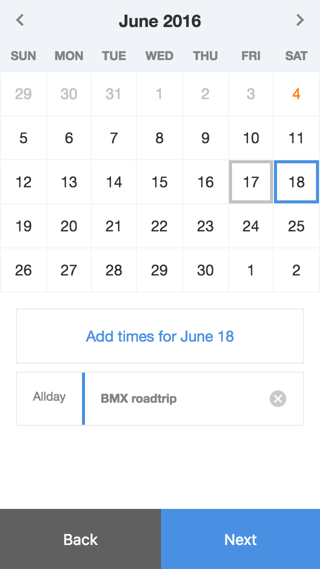
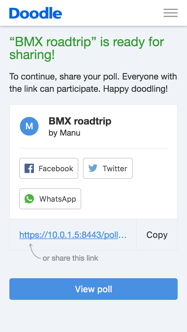
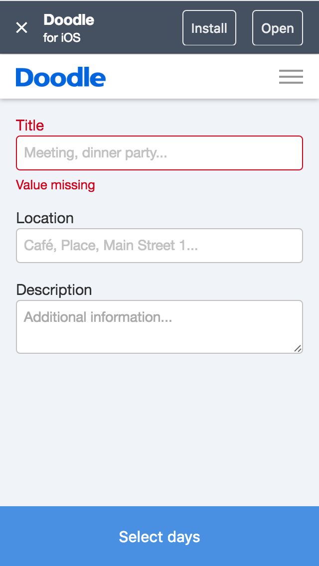
The poll creation process, besides fairly standard forms, has a combined date and time selection screen. Previously, those were 2 separate steps. The confirmation screen displayed after the poll is created is also a bit fancier than before.
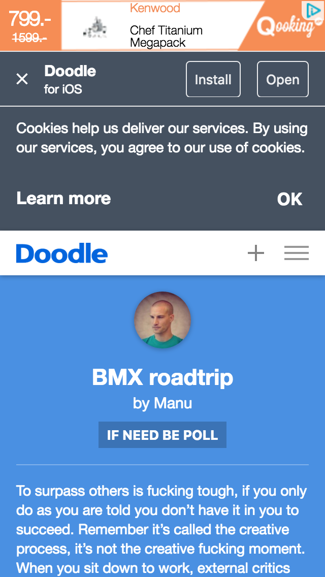
It’s not always easy to squeeze in all requirements. For example, the European Union requires its member countries to display a cookie warning. Our product managers require us to display an app download banner. People wanting everything to be free, thus ad-supported, require us to show ads. Add to all this a lengthy poll description and you get a very crowded screen, where the part that the user is actually supposed to interact with is not even visible.
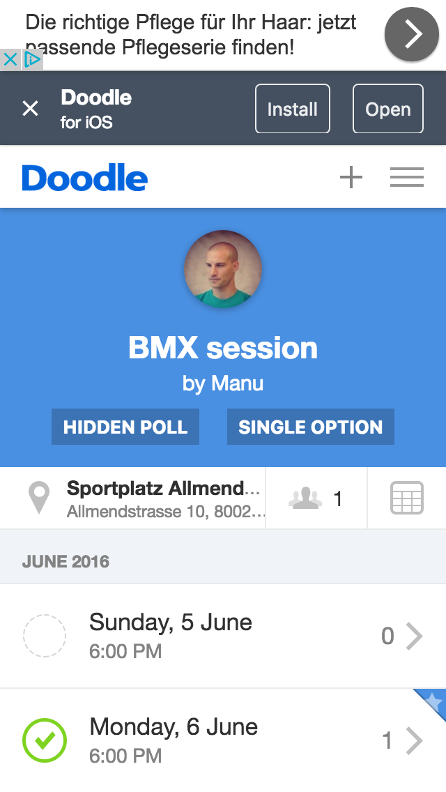
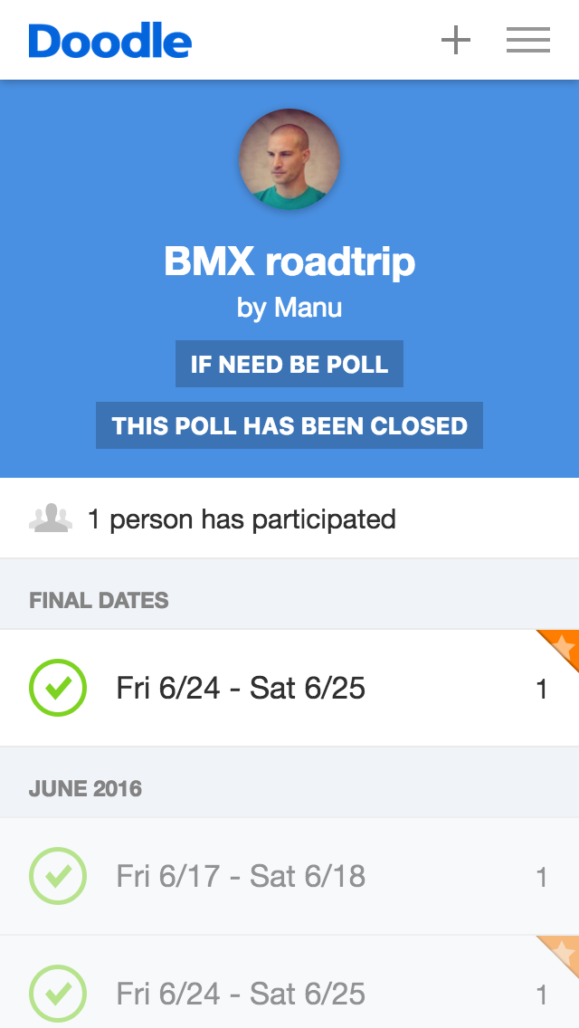
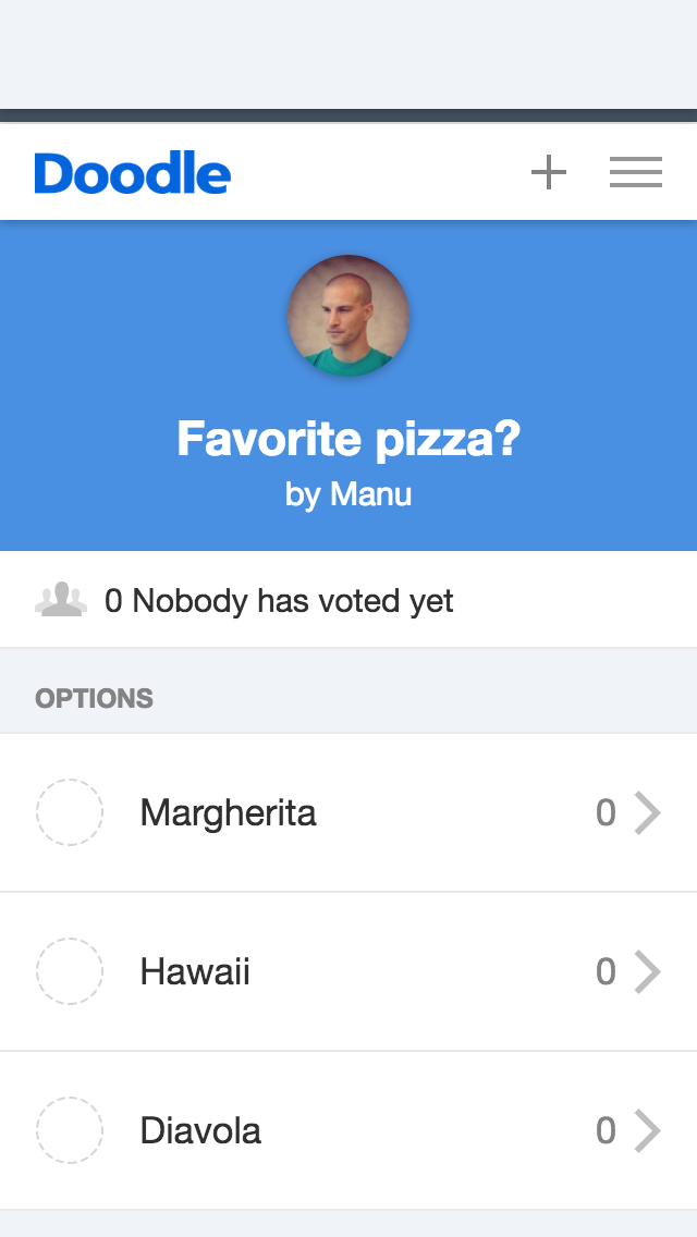
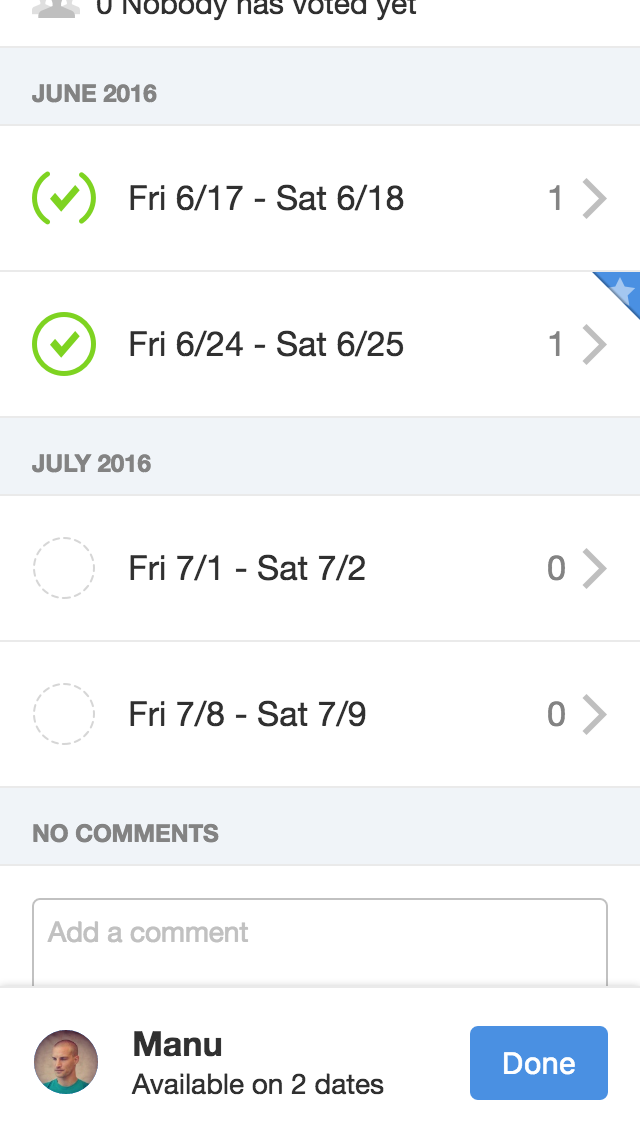
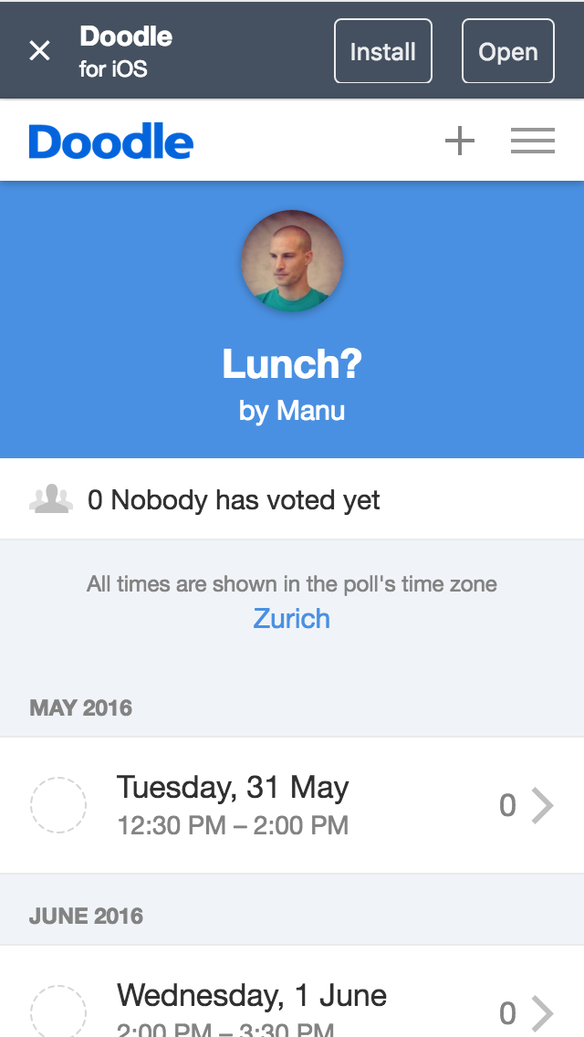
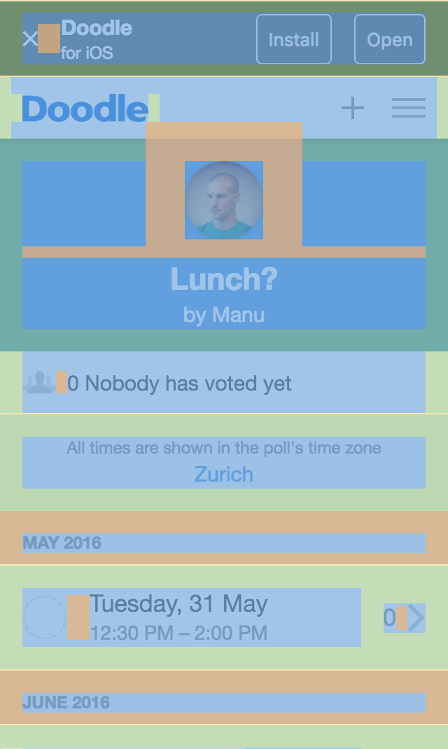
A poll’s options, i.e. the things you are voting on, are presented in a list, not a table. The most selected poll option, i.e. the one the most people voted for, is marked with a blue star. After the poll creator chose a final option and closed the poll, that final option gets an orange star. You can also notice that the row below the blue header section gets a bit crowded if the poll has a location and some participants. Further, you can see examples of different date formatting that happen depending on whether the poll option is on a single day or spans several days.
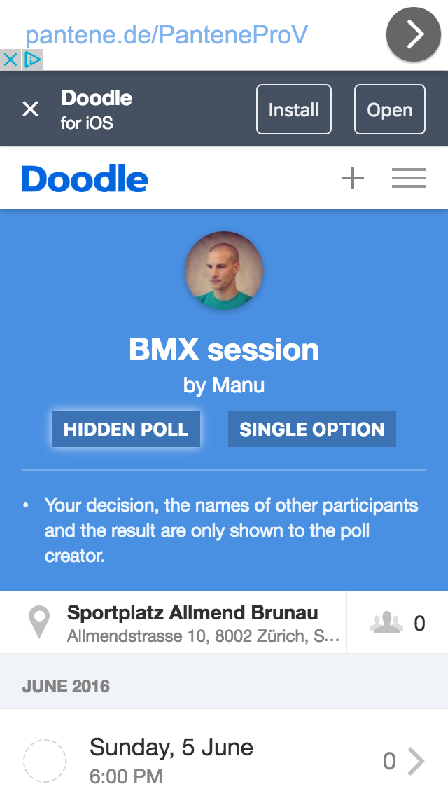
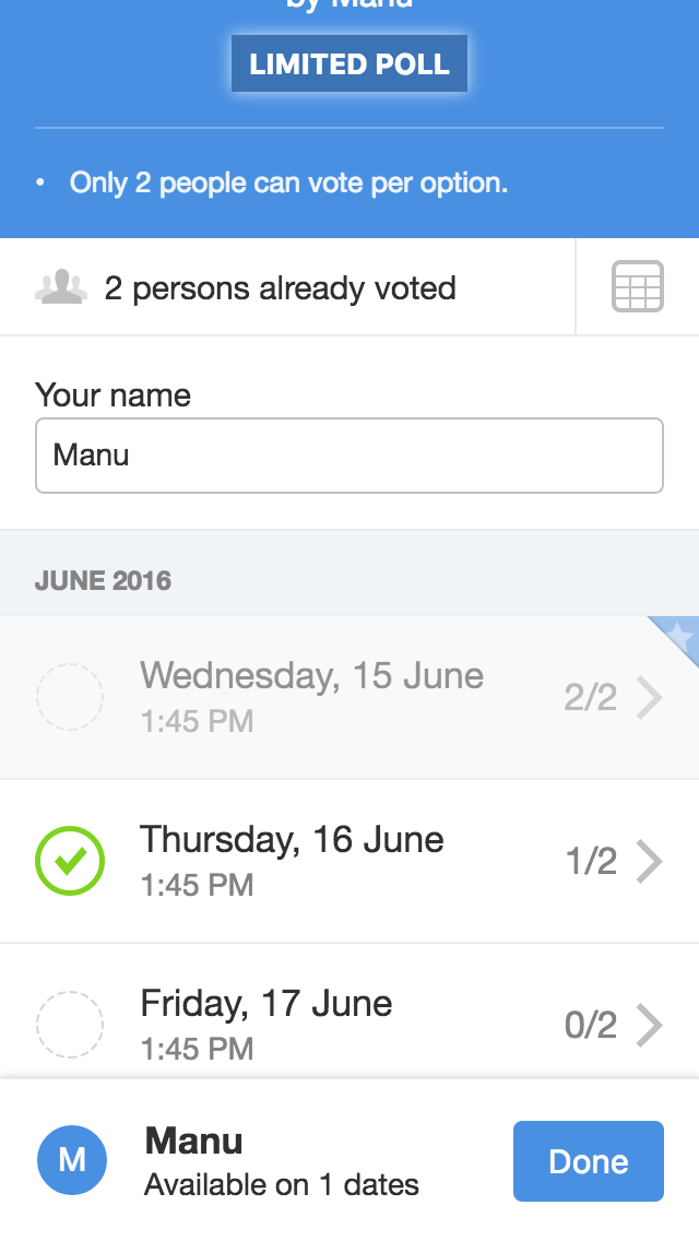
Doodle allows you to create different types of polls. There are for example so-called hidden polls where you cannot see what other people voted for (unless you are the poll creator obviously). There are single option polls where participants can only vote for 1 option among all the available ones. Limited polls allow the poll creator to limit a number of votes per option. As you can see on the screenshot, with a limit of 2, as soon as an option has 2 votes, you cannot vote for it anymore.
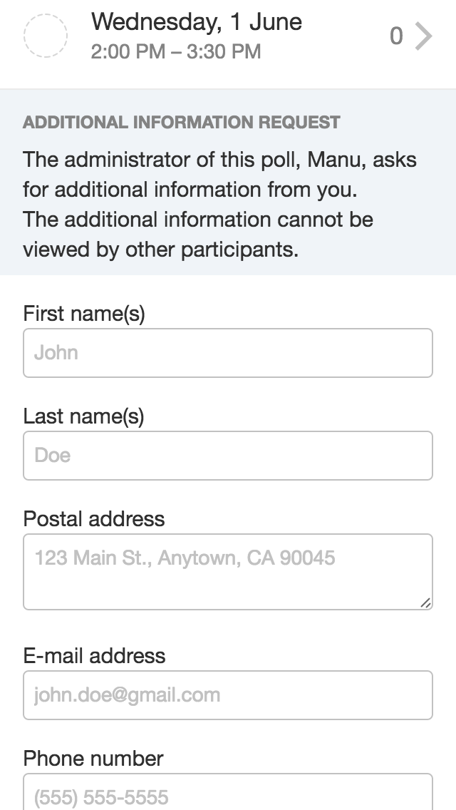
Some polls require you to enter additional information such as a phone number or a first and last name. Until now, you have only seen polls to decide on a date or time, but you can also have simple text polls.
Then there are so-called if-need-be polls where instead of only being able to accept or reject an option, you can also answer “ok, if it is really needed”. When you tap an option, you cycle through the possible answers: yes, if-need-be, no, yes, if-need-be… like so:
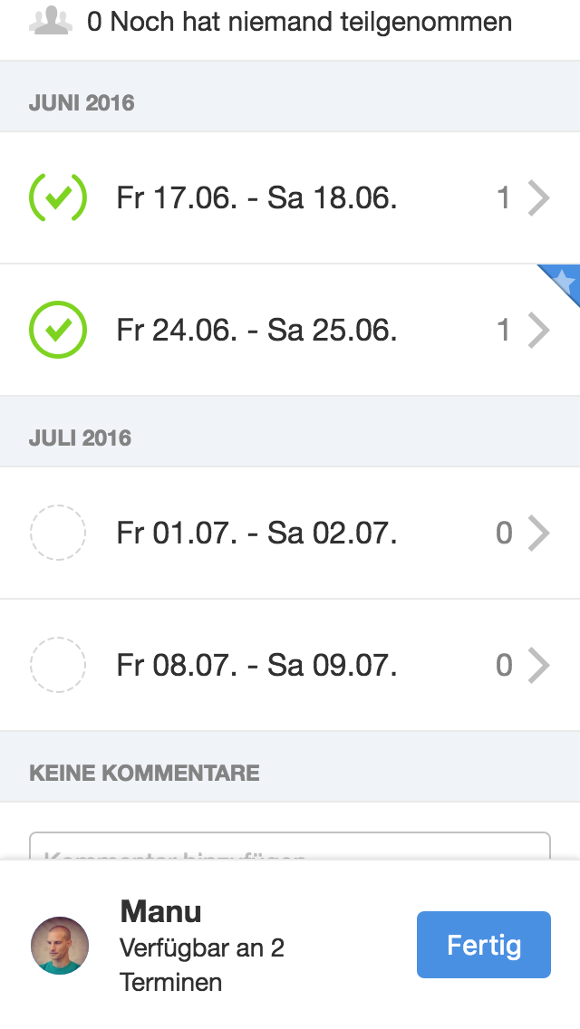
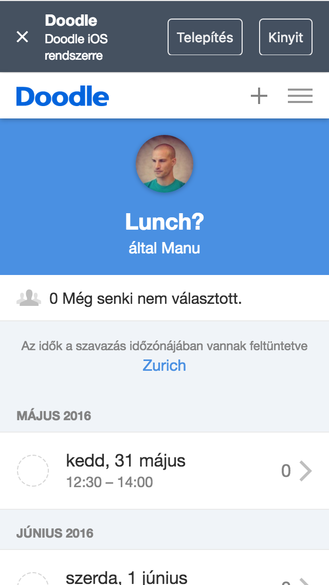
Doodle is translated in many languages. This makes building screens that work with any of them sometimes tricky. As you can see for example, German has a tendency to have longer text for everything. Date formatting varies also a lot across languages.
Date formatting differs, and so does time formatting. So far we didn’t have to handle different forms of grammatical numbers besides “one” and “more than one”. Also only left-to-right scripts. I’m actually quite curious how hard it is to support both script directions, like the WHO website does in English and Arabic, because you have to mirror the whole layout.
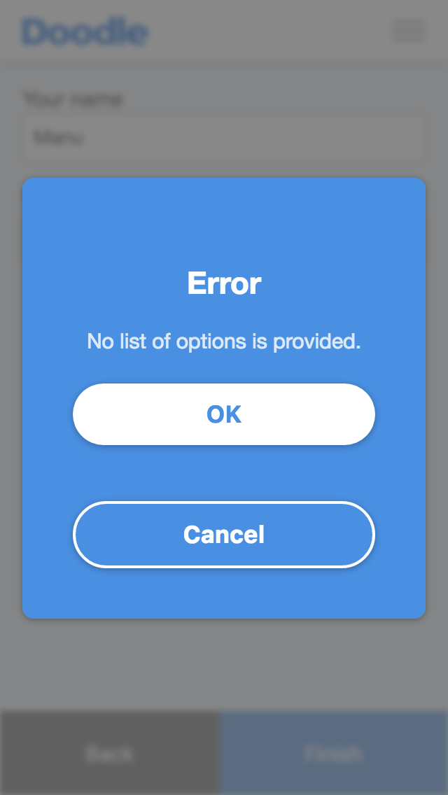
Every app has to handle error states. The new Doodle web app for mobile shows 2 types of errors: the ones related to a specific input field, that can usually be detected on the device itself, and the errors returned by the server. The screenshot provided here is a pretty bad example, because all you can do is acknowledge the error by dismissing the dialog with “OK” or “Cancel”, both doing the exact same thing. Yes, there’s still room for improvement.
On a technical note, I really like code to be clean and maintainable. This means that laying out, sizing and spacing elements on screen using some pixels values that happen to “just work” empirically is totally forbidden. There has to be a system. A lot of websites use grid systems, but the Doodle app is not a grid. If you look at the following screenshots, you will notice that there is a very small set of spacing units that are used. All the rest, vertical and horizontal centering, growing into available space etc. is handled by the browser with flexboxes. Another thing that Doodle did not have previously but has been fairly common for years in web development is a fixed set of colors to be used, and assets for high density displays.
Doodle gets a large part of its revenue from ads. With web traffic shifting towards mobile, we had to integrate ads in the new web app. There are 4 placements, but depending on the country you’re visiting the app from, you don’t get them all. We also spent — or lost, maybe — quite some time to implement methods to always show only 1 ad at once, while making sure that the one ad is actually visible, i.e. “sticky”. Additionally, all ad placements get refreshed to count more ad impressions, but not too often so that we’re not penalized by publishers. Sounds abstract and crazy? Well, it looks like it as well. In the following video, you will see ads at the top alternating with ads at the bottom, depending on user actions. There are also fullscreen ads, and static ads in the content.
Also part of this mobile redesign are several static pages that were made responsive, i.e. viewable on mobile. Examples include the boring but mandatory Privacy Policy page, the kinda empty About Doodle page etc.
I cannot keep myself from writing a couple of words about code. We’re using a new cleaner API, the same that was developed for the native Doodle apps. The whole codebase is better structured. And the test coverage is bananas: there are currently over 700 tests.
")
Last but not least, for various sad reasons, we ended up choosing Backbone and RequireJS, which are not bad, but not very trendy either. The same goes for CSS where we use SASS and Compass mainly to be compatible with the rest of the codebase.
The bad stuff
This new mobile experience went public at the beginning of 2016. At the time of writing, the poll creation part of the app is only accessible in the UK. As you’ve seen in the video, the homepage is still on the old version. So is the closing of a poll and the list of your polls in the user account. A lot of features are only available on the desktop view. This basically means that the whole mobile web user experience is totally inconsistent, even borderline unusable. A change of focus in Doodle managementland froze the state of the new mobile version. You will probably have to wait at least until 2017 for it to get better.
A brighter future?
We are now working on another redesign, but this time for the whole web experience: desktop, tablet, mobile and everything in-between. Finally. We seized that opportunity to continue building on what we started with the redesign for the mobile web, while adding such nice things as SVG sprites and a style guide. We are also experimenting with moving the whole frontend stack to webpack which will indirectly bring dependencies management, faster build times, ES6 etc.


Doodle mobile web? Doodle web mobile? web mobile Doodle? web Doodle mobile? I don’t know… ↩︎