I see my time at Doodle as four chapters: maintenance and APIs, a new mobile web app, a complete responsive redesign, and the team practices that held it together. I was originally hired as a full-stack engineer for BookMe, but that product was discontinued shortly after I joined.
Maintenance and small features
I started by helping introduce Sass and cleaning up the existing CSS, taking stock of fonts, colors and sprites. It made the team aware that limiting the number of colors and defining a style guide would pay off in the future.
Two months in, I became the mentor of Angela, our intern. With no prior frontend experience, she chose to migrate FullCalendar from version 2 to 3 for the calendar view of Doodle polls.
In parallel, Spyros and I specified, implemented and documented a new JSON API for the upcoming iOS app, built by an agency. I could draw on previous experience building APIs with the same stack and well-structured data transfer objects, rather than ad-hoc JSON. The iOS app also needed push notifications, which was new territory for me.
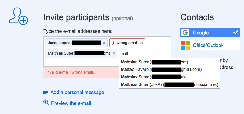
In fall 2014, I finally worked on my first user-facing feature: a new step in the poll creation wizard for inviting participants, with address book integration.
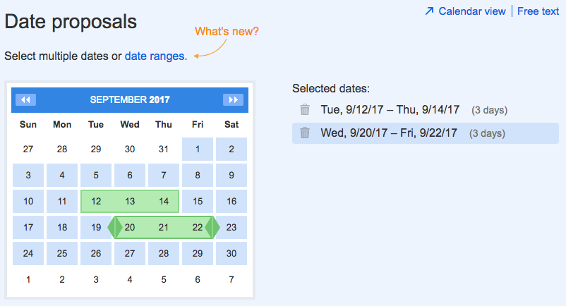
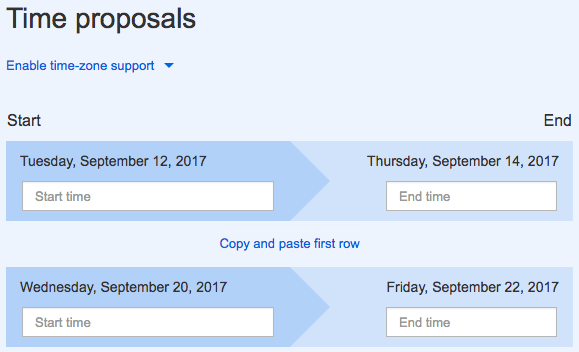
The following months were mostly refactoring: introducing constants, structuring client-side data better, using icon sprites everywhere, and so on. Then came multi-day events, the first major feature I built with Mirjam as product manager; until then, Malte had led the product.
In early 2015, iOS development moved in-house, a new office opened in Berlin, and Matthias took over from Malte as web product manager. An Android app was in the works as well.
A new mobile web app
In April 2015, we started building a new mobile web app, designed by an external agency since we had no in-house designer yet. With Tom, who had recently joined along with Jay, I built a React prototype, benchmarked against a Backbone prototype built by Spyros and Jay. Backbone won on server-side rendering, which settled the stack for the next couple of years: Backbone with a home-grown framework on top, many Jasmine/Karma unit tests, and Cucumber/WebdriverIO integration tests.
Besides building the poll participation page, with its very tricky ad behaviors, and the poll creation wizard, I made a set of existing content pages responsive and made sure new pages were responsive too. Work on the API continued, and I implemented Apple in-app purchases (which were never used). In summer 2015, our small team also redesigned MeetMe as doodle.me, a project that was stopped shortly afterwards.
The mobile web app went live in early 2016 with a completely new look. A mobile-specific version of a service might seem surprising at a time when responsive design was the norm, but that was the decision at the time. Here is what we built.
Old and new
First, the previous version, showing:
- the home page (00:00–00:07)
- creating a poll (00:08–00:57)
- writing and reading a comment (01:04–01:30)
- participating in a poll (01:31–01:52)
- choosing a final date, that is, closing the poll (01:53–02:19)
And the new Doodle mobile web app, showing:
- the home page (00:00–00:05)
- creating a poll (00:06–00:41)
- participating in and commenting on a poll (00:42–01:20)
Some screens are unchanged, and some features are missing. Let’s take a closer look.
Creating and reading polls
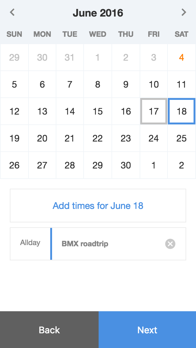
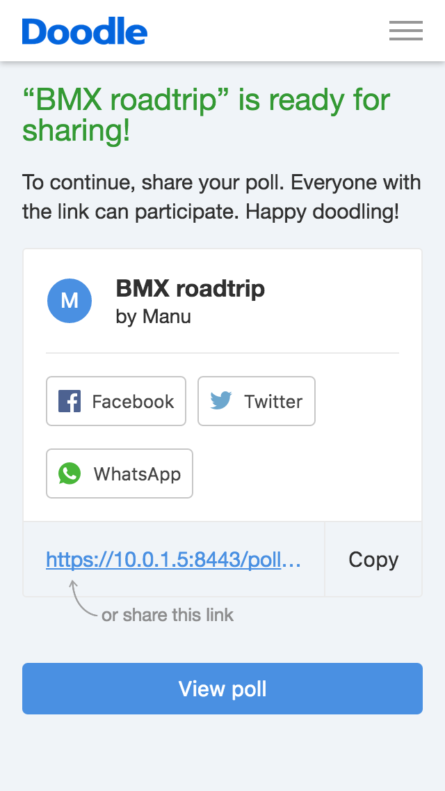
Apart from fairly standard forms, poll creation now has a combined date and time selection screen, where there used to be two separate steps. The confirmation screen shown after creating a poll is also a bit more polished.
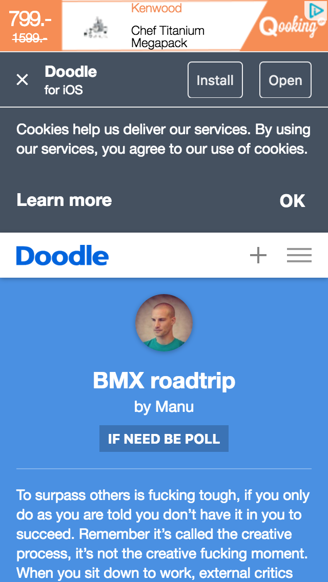
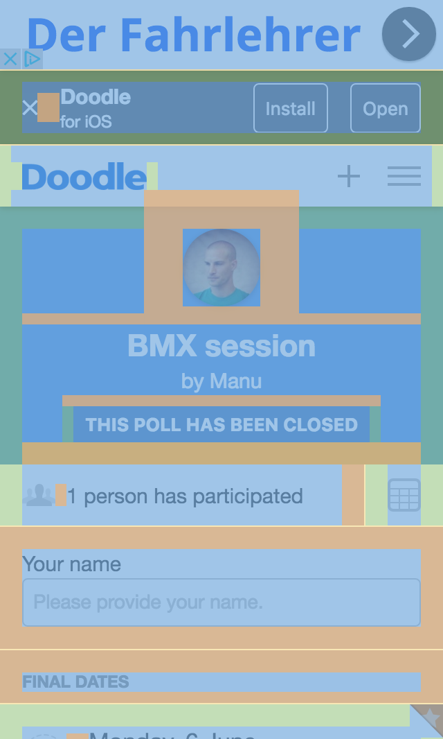
Fitting in every requirement is not always easy. The EU requires a cookie notice, product management wants an app download banner, and ads keep the service free. Add a long poll description and the screen gets so crowded that the part users actually need to interact with is no longer visible.
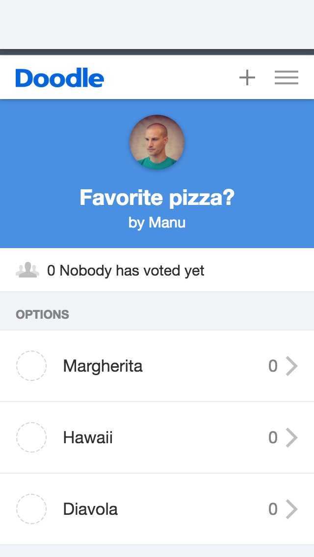
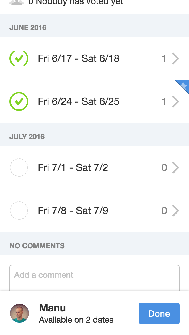
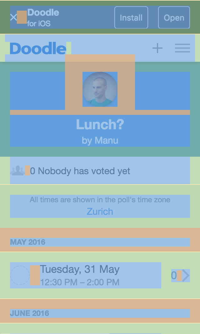
A poll’s options, the things participants vote on, are shown as a list rather than a table. The most popular option is marked with a blue star, and once the poll creator closes the poll, the chosen option gets an orange star. The row below the blue header gets crowded when a poll has both a location and participants. The screenshots also show how dates are formatted differently for single-day and multi-day options.
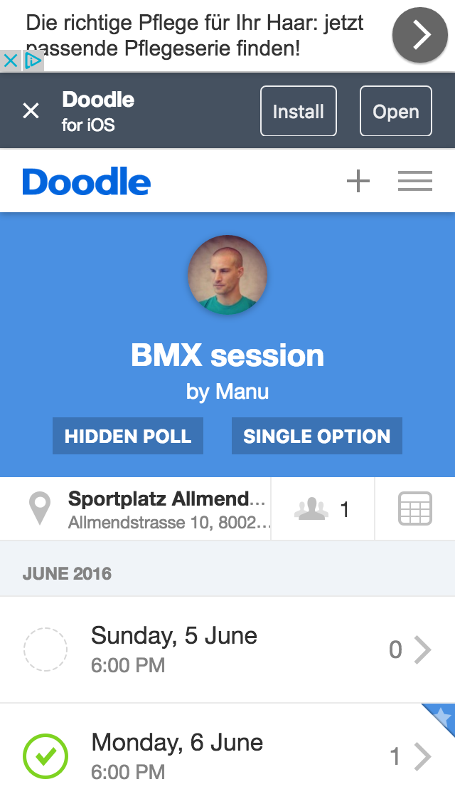
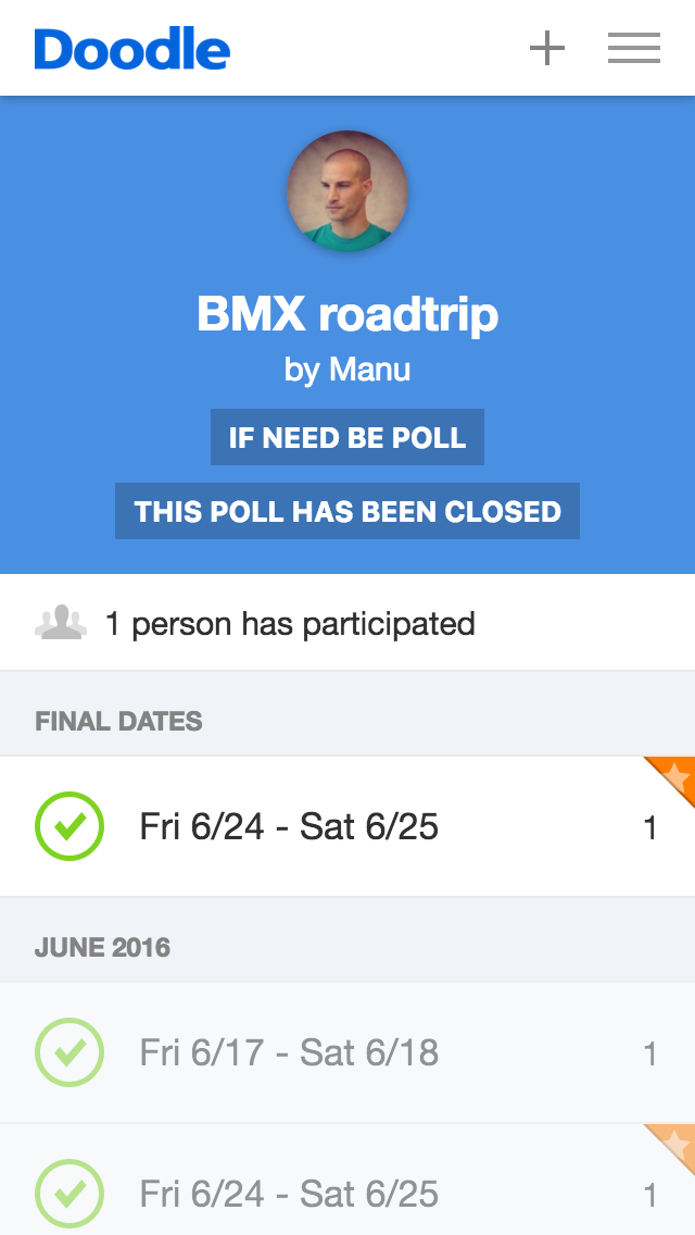
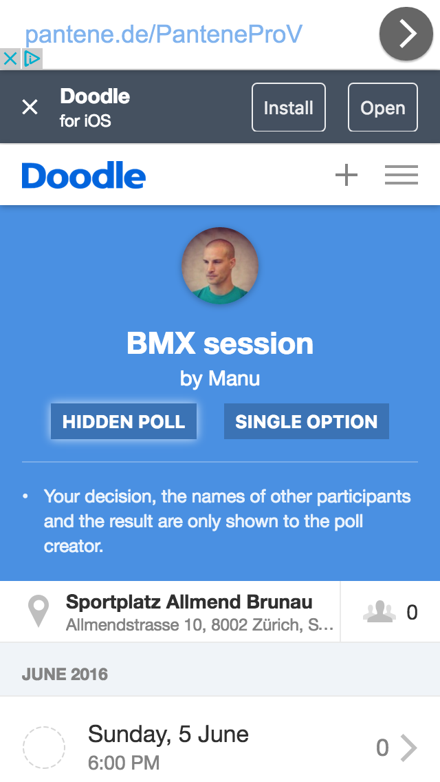
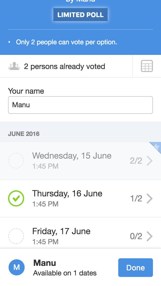
Doodle supports several types of polls. In hidden polls, participants cannot see each other’s votes (only the poll creator can). In single choice polls, participants can vote for only one option. Limited polls cap the number of votes per option: with a limit of 2, an option with two votes can no longer be chosen.
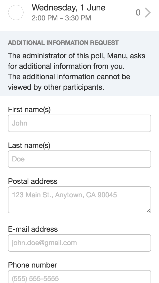
Some polls ask participants for additional information, such as a phone number or their full name. And besides dates and times, polls can also be about anything, as simple text options.
In if-need-be polls, participants can answer yes, no, or “if need be”. Tapping an option cycles through the answers:
Languages, errors and spacing
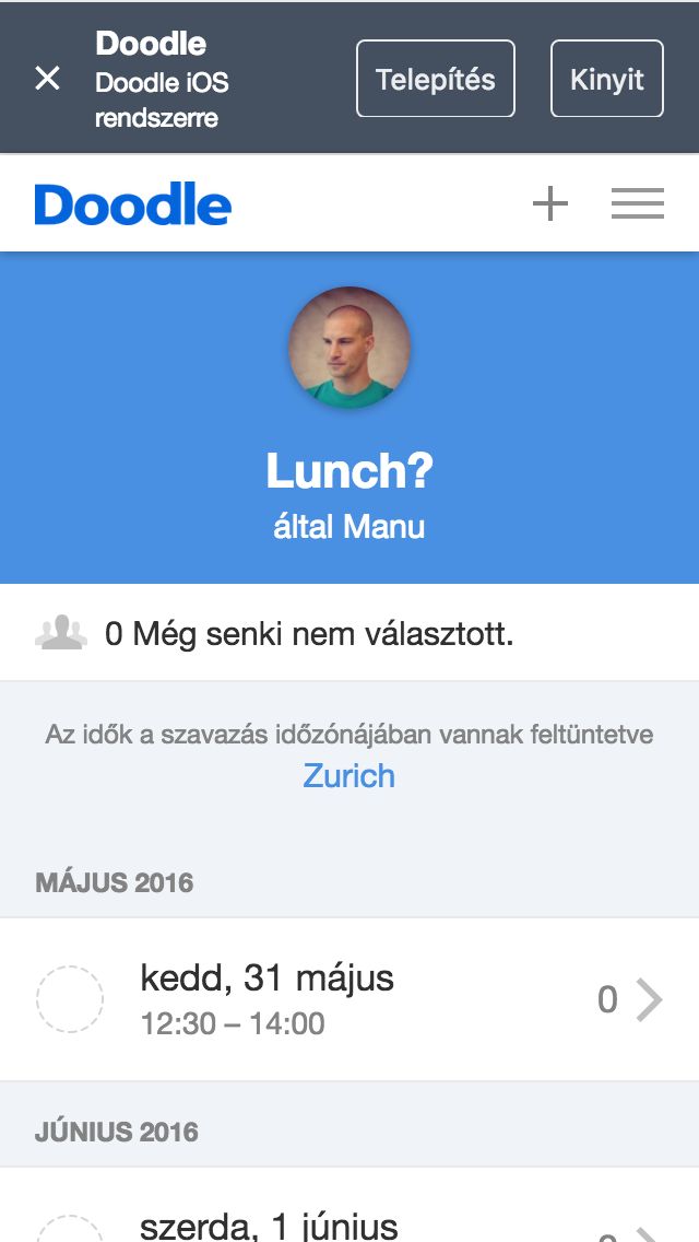
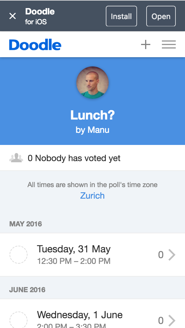
Doodle is translated into many languages, which makes some screens tricky to build. German, for example, tends to need more space for everything, and date formats vary a lot between languages.
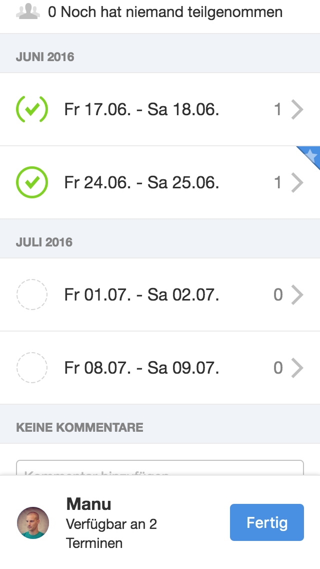
Time formats differ too. We only had to handle two grammatical numbers, singular and plural, and only left-to-right scripts. I was curious how hard it would be to support both reading directions, as the WHO website does in English and Arabic, since the whole layout has to be mirrored.
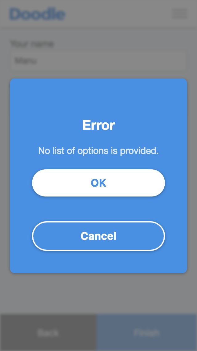
The app shows two kinds of errors: field validation errors, usually detected on the device, and errors returned by the server. The second screenshot is not a great example, since “OK” and “Cancel” do exactly the same thing. There was still room for improvement.
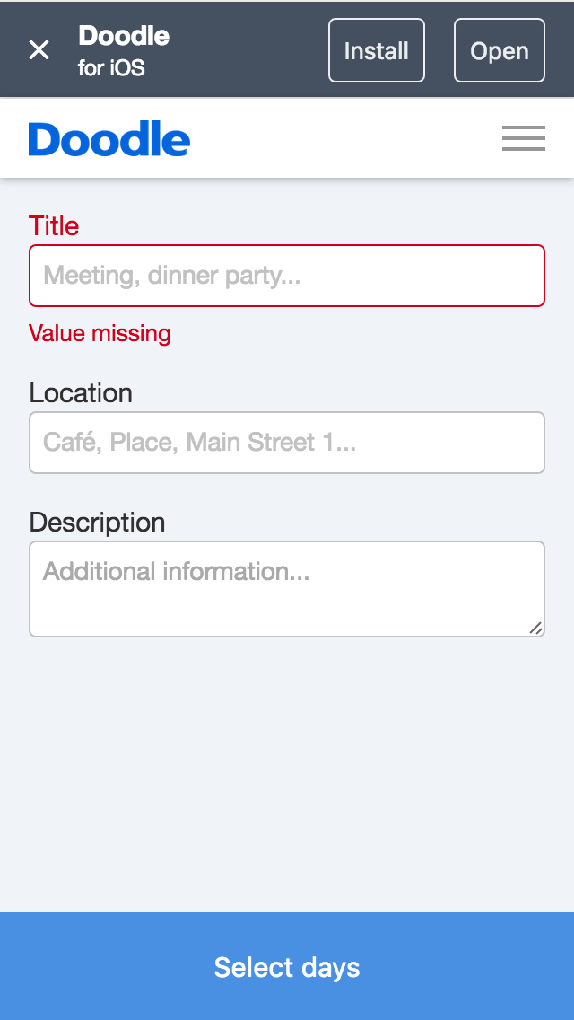
I care about clean, maintainable code, which rules out pixel values that just happen to work. There has to be a system. Many websites use a grid, but the Doodle app does not lend itself to one. Instead, as the screenshots show, it uses a very small set of spacing units, and lets flexbox handle centering and filling the available space. The app also got a fixed color palette and assets for high-density displays, both long overdue at Doodle.
Ads
Ads were a large part of Doodle’s revenue, and with traffic shifting to mobile, the new app had to include them. There were four placements, depending on the visitor’s country. We spent a lot of time making sure only one ad was visible at a time and that it stayed visible (“sticky”), and refreshing placements often enough to count more impressions, but not so often that ad networks would penalize us. In the video, ads at the top alternate with ads at the bottom depending on what the user does; there are also full-screen ads and static ads within the content.
Under the hood
The redesign also made several static pages responsive, such as the privacy policy and the about page.
The app used a new, cleaner API, the same one built for the native apps. The codebase was much better structured, and test coverage was excellent, with over 700 tests.
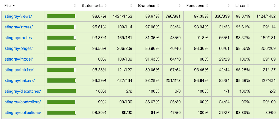
For compatibility with the rest of the codebase, we used Backbone and RequireJS, solid if not fashionable choices, and Sass with Compass for CSS.
Limits
When the new mobile experience went live in early 2016, poll creation was only available in the UK, the home page, closing a poll and the poll list were still on the old version, and many features were only available in the desktop view. The result was an inconsistent mobile experience. A change in company priorities then froze development of the mobile app, before it got a new dashboard and home page, and it only worked in browsers that supported flexbox.
The redesign
In early 2016, the mobile web app (code-named Stingray) gave way to a complete redesign of doodle.com. It was initially planned for desktop only, but the engineers argued for reusing the previous year’s work, effectively adopting a mobile-first approach.
We also worked style-guide-first: we built reusable components, showcased them in a style guide, and then replaced the existing elements in Stingray with them. It went smoothly, helped by the decision to finally drop server-side rendering. We also adopted SVG sprites and experimented with moving the frontend build to webpack, which brought dependency management, faster builds and ES2015.
With the backend almost entirely frozen, I could focus fully on frontend development. Step by step, we worked towards feature parity with the existing doodle.com. I worked on:
- poll administration: closing, reopening and deleting polls, and exporting them to Excel and PDF
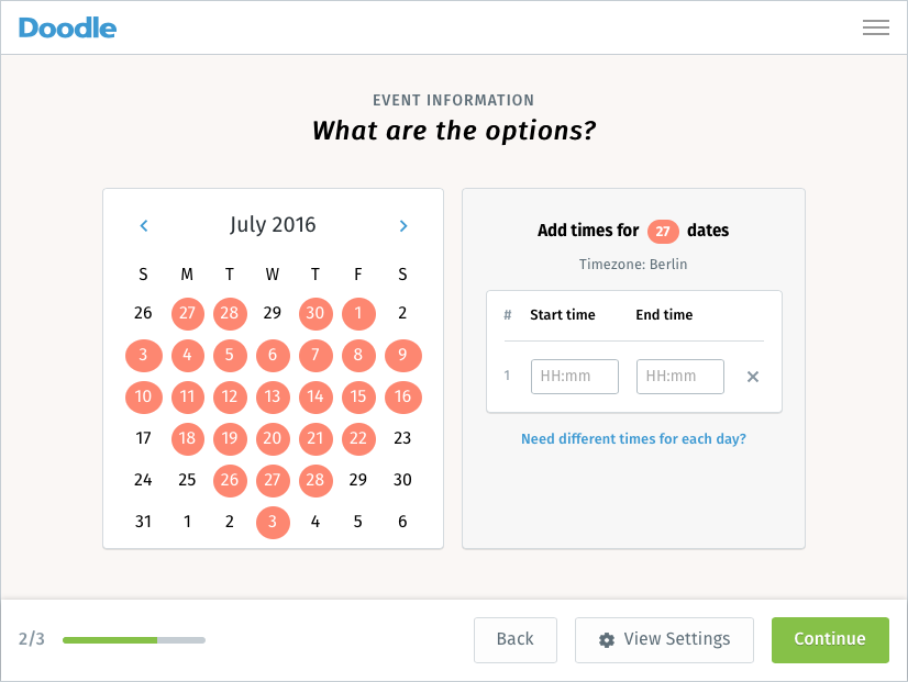
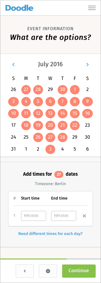
- several iterations of the time picker in the second step of the poll creation wizard
- improvements to polls with time zones
- every variation of the header: small and large screens, white and blue, and a distraction-free version for the wizard
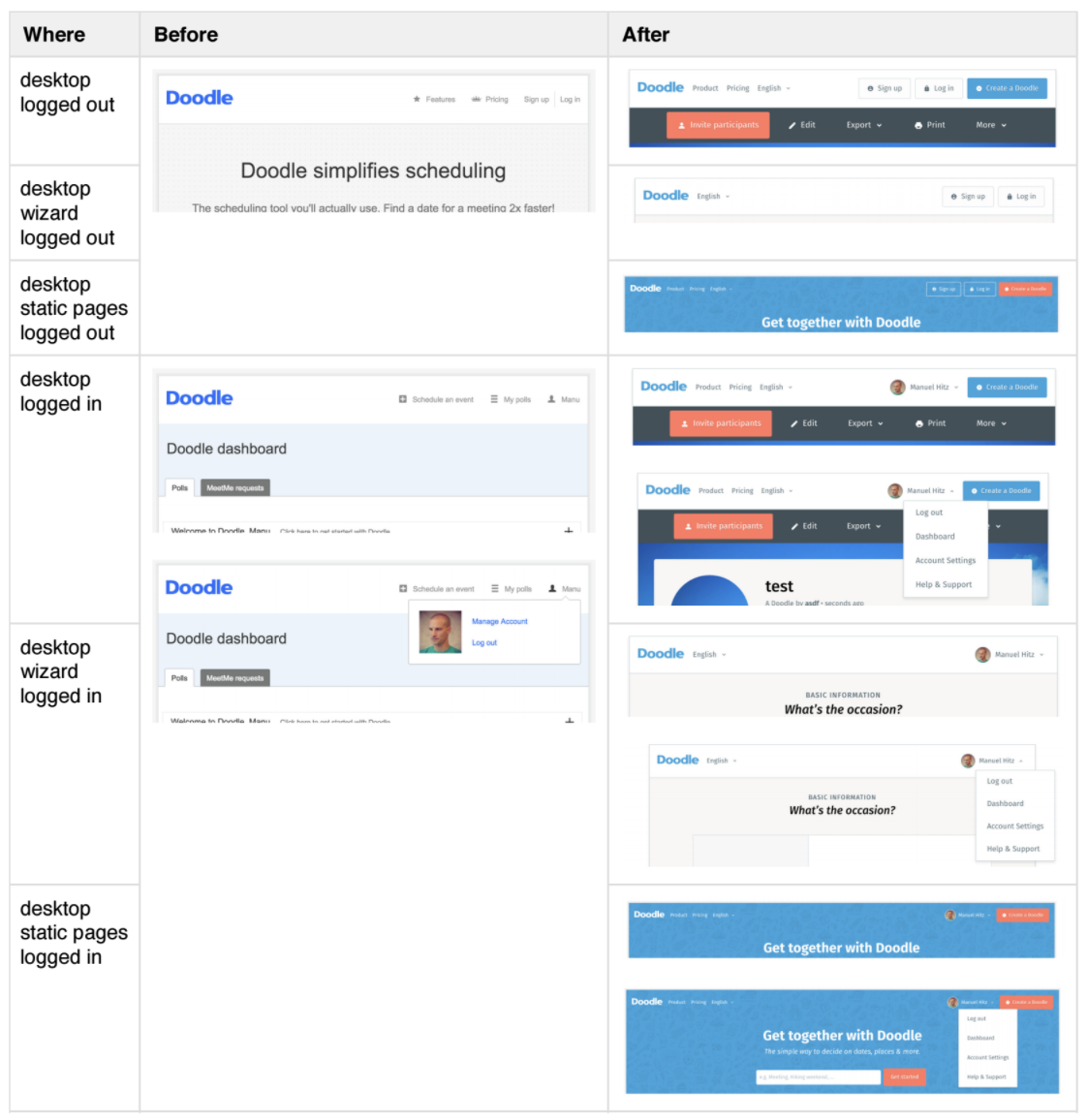
- a tracking overhaul, moving from Kissmetrics to Google Analytics and improving what we tracked
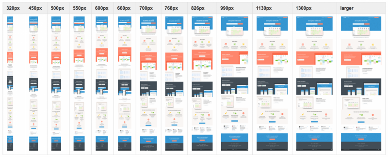
- a responsive home page with, admittedly, too many breakpoints
- a unified poll participation view that works on every screen size. Tom did most of the implementation, and did a tremendous job; I advocated for it with the product owner and the designer, using hand-drawn sketches of how it could work. A single HTML structure switches from a list to a table purely through CSS media queries, based on the viewport width.
- new ad formats, such as an interstitial before the poll participation page and “calendar ads” shown on a given date of a poll
- FullCalendar week view support in the poll creation wizard and on the participation page, including event conflicts and the choice of calendars to display
- broader browser support, down to Internet Explorer 10
- incremental UI improvements, such as the sticky action bar
Team practices
I believe code knowledge should be shared across the whole team, which is why I read every commit to Doodle’s main repository. That is not something I expect from everyone, so I started doing consistent, structured code reviews on GitHub and convinced the team to do the same. With Tom, we then formalized the use of pull requests, which I am sure did a lot for code quality. I also started referencing Basecamp to-dos, and later Jira issues, in commit messages to give code changes more context. I brought that habit from my previous job; it took some getting used to at Doodle, but it stuck.
As Spyros once pointed out, I was something of a behind-the-scenes scrum master, picking the parts I was interested in. I never wanted to write retrospective minutes or prepare demos, but I did start documenting the web engineering process.
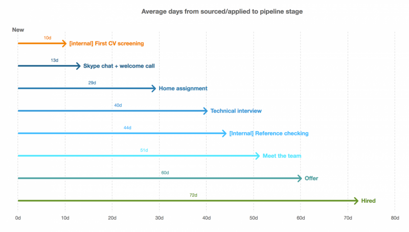
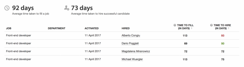
In 2017, I led recruiting for two frontend positions, which became three, then four. I learned a lot, and we did reasonably well, though there was room for improvement, especially in speed. I am particularly proud of having brought a woman developer onto the team.